In addition to renaming its core operating systems, today at WWDC Apple announced a major update to the visual design of iOS, iPadOS, macOS and more. Inspired by some of the fancy graphics used in the Vision Pro, this UI overhaul not only features revamped icons and an emphasis on translucent elements, it also looks to bring a much more unified look to Apple’s flagship software platforms.
Based on a design theme called liquid glass, Apple’s new visual language brings increased consistency across the company’s OSes. The company says the UI is informed by surrounding content and can intelligently adapt to light and dark modes while supporting sophisticated traits like real-time rendering and specular highlights.
In iOS, the home screen has been totally revamped with new app icons, including all-clear options. Wallpapers and the lock screen can dynamically scale to better accommodate things like photos, album art and on-screen text. Many buttons also have a new floating design that makes them easier to see without becoming distracting.

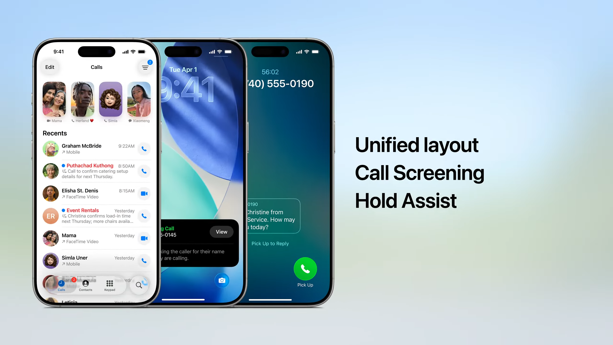
Some important apps have also gotten individual makeovers such as the Phone app, which now has a floating toolbar alongside fresh features such as Call Screening and Hold Assist similar to what we’ve seen from Google’s Pixel handsets.
Meanwhile, the Camera app’s interface has been significantly simplified with the ability to quickly swipe between photo and video modes. There’s also a dedicated tab for your library and improved organization for other categories like albums.
Similar UI updates are also heading to CarPlay, which is getting a matching visual refresh featuring an revamped home screen, new widgets for things like Live Activities and translucent design elements.
This story is still developing…
This article originally appeared on Engadget at https://www.engadget.com/mobile/smartphones/apples-new-liquid-glass-design-is-its-biggest-visual-update-in-years-172158766.html?src=rss